Blog
Effective Period Comparison in Looker
Reading time.
1 min
Wrtitten by
Cyril Toneatto
Business Intelligence

For Looker users, comparing multiple periods in a visualization can be quite challenging. Currently, Looker does not offer a straightforward, native way to achieve this. As BI engineers, our goal is to provide business users with a solution that is flexible, easy to use, and simple to understand for creating time-period comparisons.
In this article, I’ll demonstrate with a simple example how our “period comparison” solution has been successfully adopted by many of our clients and how it might be valuable for you as well.
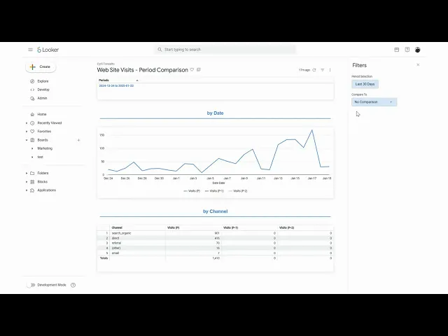
What you can achieve
Imagine a dashboard where you can seamlessly compare metrics across different time periods. For example:
Visualizing website visits over a week and comparing them to the two preceding weeks.
Displaying year-over-year comparisons of weekly visits in an easy-to-read table format.
Here’s a quick demo of how this solution looks in action:
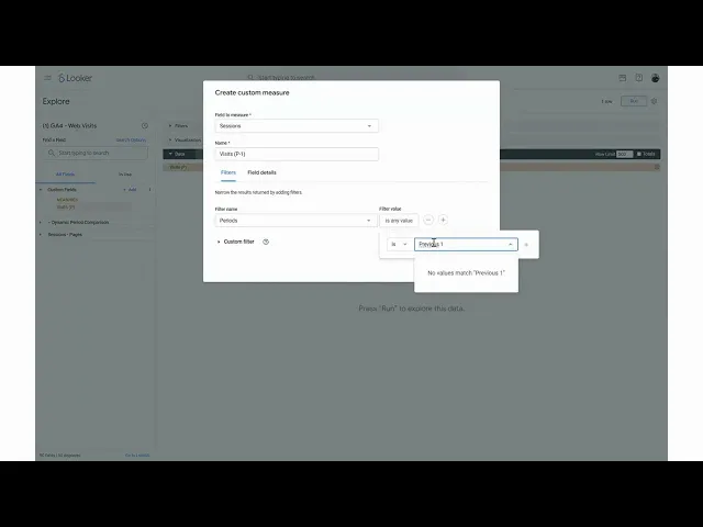
Graph 1 : Step by Step
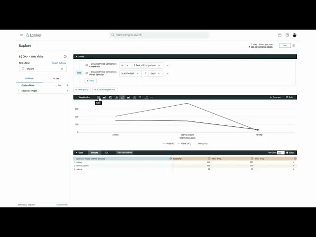
Graph 2 : Step by Step
Conclusion
Now that you’ve seen the results, if you’re interested in getting the code, and implement the solution in your company leave a like or a comment, and I’ll share a detailed explanation in an upcoming article.
Thank you
If you enjoyed reading this article, stay tuned as we regularly publish technical articles on Looker and how to leverage it at best. Follow Astrafy on LinkedIn to be notified of the next article ;).
If you are looking for support on Looker, Data Stack or Google Cloud solutions, feel free to reach out to us at sales@astrafy.io.
Written by

Cyril Toneatto
Head of Business Intelligence


